Graphic Design:
Logos, Letterheads,
Business Cards, Advertisements,
Websites, Maps, Signs, Technical Illustration, Montages, Program
Interfaces…

What does your 'shop window'
say about your company?
A logo, letterhead or advert
is often the first visual contact that a new customer will have
with your business, so they need to be right. If you get these
wrong, your projected image could end up working against you!
When starting a new business,
important visual details in this area is often an aspect that
gets overlooked, that is why it is wise to have professional
help at hand.


But good graphic design
encompasses far more than that -
Creative visuals that work need
excellent graphic design skills. Items designed well not
only look good, they are also easy to understand and use.

Below are examples of our
graphic design skills used in key areas -
| Logos: A
logo is the backbone of your company's image, as it is
stamped on to all aspects of visual communication -
Business Cards, Letterheads, Adverts, Merchandising. So it
is very important to create a design that speaks to the
client and that can be carried through all aspects of
the business model. |
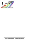
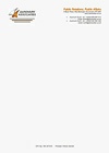
| Letterheads: These
are the most common form of communication and make a
statement to one and all, of what your company is about. |
| Business
Cards: This is where impressions really count, as
cards are very often the only visual reminder after first
contact. |
| Advertisements: Advertising
takes up a huge expenditure for many businesses. Targeting
the right marketing group with a clear easy to understand
message is essential for a
cost effective campaign. |
| |
| Does
new design work need to fit in with an existing corporate
identity - |
| |
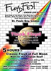
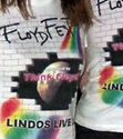
| Keeping
the strong brand image was an essential part of the
FloydFest concept. |
| |
|
 |
 |
|
|
Click
to view logo. |
Click
to view business card. |
|
|
|
 |
 |
 |
|
|
Click
to view poster. |
Click
to view letterhead. |
Click
to view merchandise. |
|
|
| |
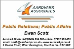
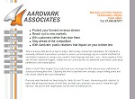
| Aardvark
has had a strong presence in the PR field since 1987, but
required a brand makeover to strengthen their business
identity in the 21st century. |
| |
 |
 |
| Click
to view logo. |
Click
to view business card. |
 |
 |
| Click
to view website. |
Click
to view letterhead. |
|
| |
| Of
course graphic design covers so much more than corporate
identity. |
| |
| Maps: Location
maps for different clients needs can be an interesting
creative challenge. |
| |
|
|
| |
| Signs: Effectively
sign written vans speak volumes about your company. |
| |

 |
| Click
van to view. |
| |
| Montages: A
great way to say a lot about your business with just one
image. |
| |
| The
montage below was created for a design and build firm of
architects. |
| |
 |
| |
| This
montage was created for an online photographic
collection. |
| |
 |
| |
| Program
Interfaces: |
| |
 |
 |
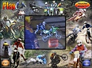
| Interactive
movie screen. |
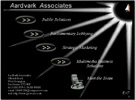
Interactive
business card. |
|
| |
| Technical
Illustration: For examples please visit
Technical
Authoring.
|
| |
| Websites:
For examples please visit Website
Design. |
| |
|